Policy Watch
An eye on policy changes in Ireland, the UK and beyond
Part Three: What can the Census tell us about the relationship between deprivation and social housing provision?
Part Three in PPR’s new policy series ‘A new look at housing: what the census data can tell us about social housing provision and deprivation’
As we have seen throughout this blog series, the census can shed light on levels of social housing provision at very small geographies, in ways which neither the NIHE nor the Department for Communities’ public data provision allow.
Setting the census data on deprivation levels and social housing provision against each other enables us to map out the expected provision of social housing based on the need indicated by the deprivation figures.
We would hope and expect that the provision of social housing has been designed to be in proportion to need; so the more deprived an area is, then the more social housing it should have (for every unit increase in deprivation you’d expect a similar increase in social housing provision). In statistical terms, we’d call this a positive relationship: as deprivation increases, social housing provision should increase too.
So what does the data tell us? As deprivation increases, does the provision of social housing increase at the same rate? Or do some areas have less social housing than we would expect, on the basis of how deprived they are- and do some less deprived areas have more social housing that we would expect?
Figure 5 (below) maps all the Super Data Zones in Northern Ireland according to their level of deprivation and the % of social housing they have. It shows that increasing deprivation and social housing provision are positively related - so we can say that the more deprived an area is, the more likely it is to have social housing.
But graphs like these are complicated to understand, so let’s go through it step by step.
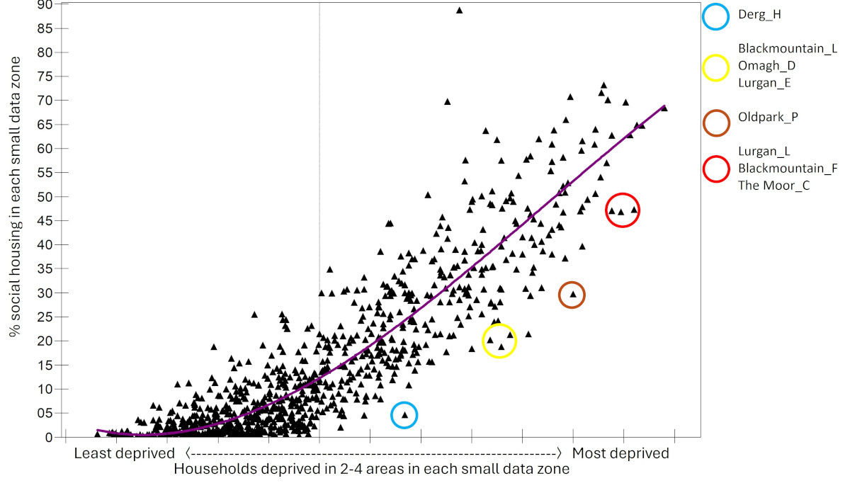
Figure 5: The relationship between deprivation and both actual (the triangles) and predicted (making up the purple line of best fit) social housing provision
- Each black triangle represents a Super Data Zone (SDZ), somewhere in Northern Ireland.
- The location of each triangle along the x/horizontal axis shows how deprived that SDZ is. So the triangle with the blue circle around it, representing the SDZ ‘Derg H’ in Derry and Strabane is about 8% more deprived than average.
- The location of each triangle on the y/vertical axis, reflects the proportion of social homes in that SDZ. Returning to our example of Derg H, we can see that it sits at 4% of homes in that area are social homes.
- The purple line in the graph, ‘driven’ through the spread of SDZs/ triangles is a ‘line of best fit’. It’s the best guess we can make using the data we have as to the proportion of social housing we could expect in a SDZ, based on how deprived it is. So for example, according to the line of best fit, an SDZ which was around 25% more deprived than average should have around 50-55% social homes.
And clearly from the distribution of triangles/SDZs in the graph, it’s not perfect. Some triangles/SDZs/actual social housing provision points are above the purple, best fit line. This means that there is more social housing in these SDZ than we would expect, based on the deprivation measure used here. However, some triangles are below the purple, best fit line. This means that there is less social housing provision in these SDZs than we would expect, based on the deprivation measure used here.
…[despite] ‘Lurgan L’ in Armagh, ‘Blackmountain C’ in Belfast and ‘The Moor C’ in Derry… having high levels of deprivation (almost a third higher than average), they have lower than expected levels of social housing
For example, take a look at the three triangles in the red circle. These represent ‘Lurgan L’ in Armagh, ‘Blackmountain C’ in Belfast and ‘The Moor C’ in Derry. Despite having high levels of deprivation (almost a third higher than average), they have lower than expected levels of social housing.
So, what’s the take home message thus far? Answer: across Northern Ireland as a whole deprivation and social housing are positively related. To some extent, state provision of social housing is in proportion to need. However, there is a significant amount of variability, in the many triangles/SDZs that fall above the purple line of best fit, and the many that fall below. Is this variability simply random? The luck of the draw? Or, through difficulties in housing governance or other factors, have some geographical areas benefited more, others less? To help answer this question we look more closely first at local council areas and then at District Electoral areas.
A focus on Local Government Districts
We’ve repeated the analysis above at local council level. Figure 6a shows the ‘lines of best fit’ for each of the 11 Council areas.
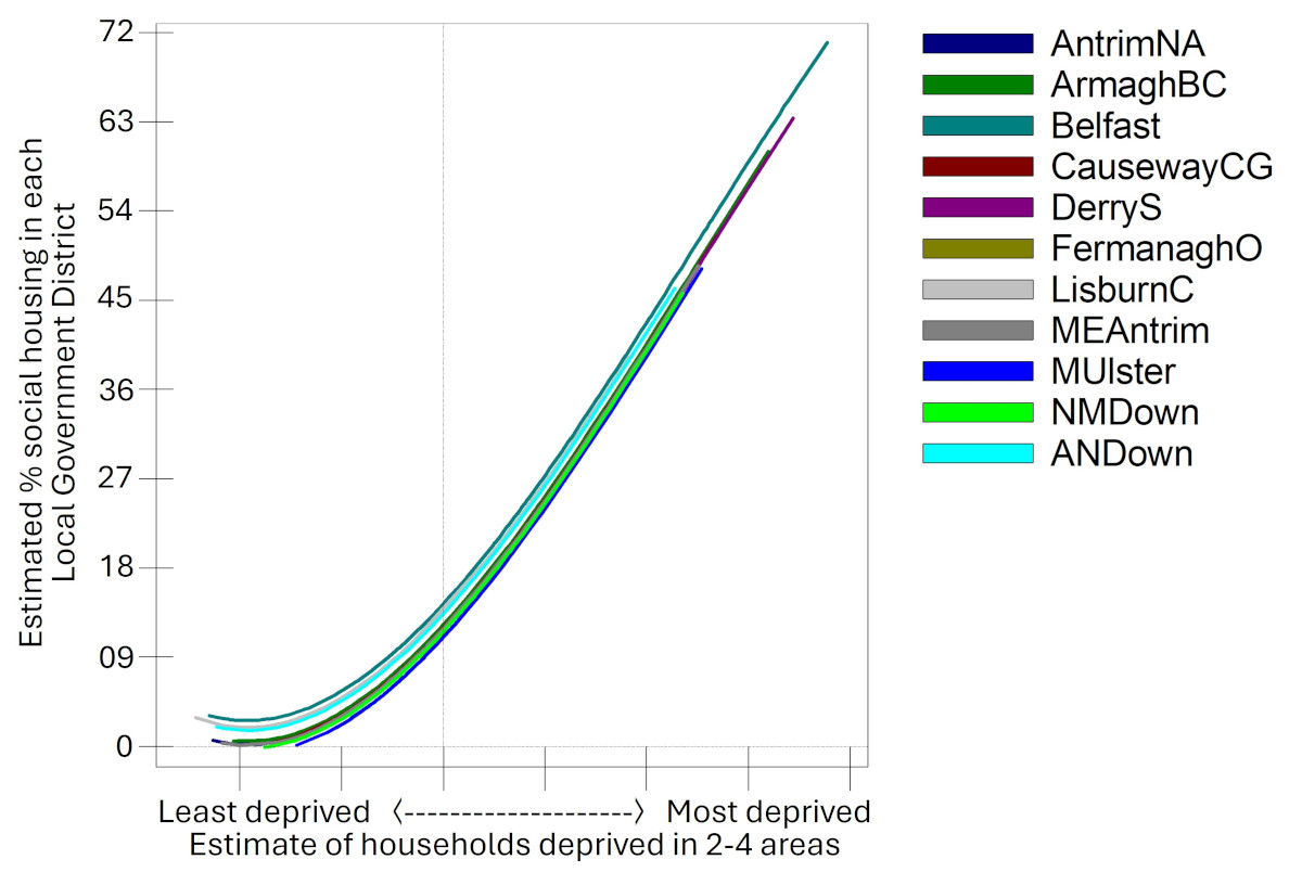
Figure 6a: Social housing provision predicted on the basis of deprivation across LGDs
In each area, as deprivation levels in SDZs increase, social housing increases. And the rate, overall, is relatively similar:
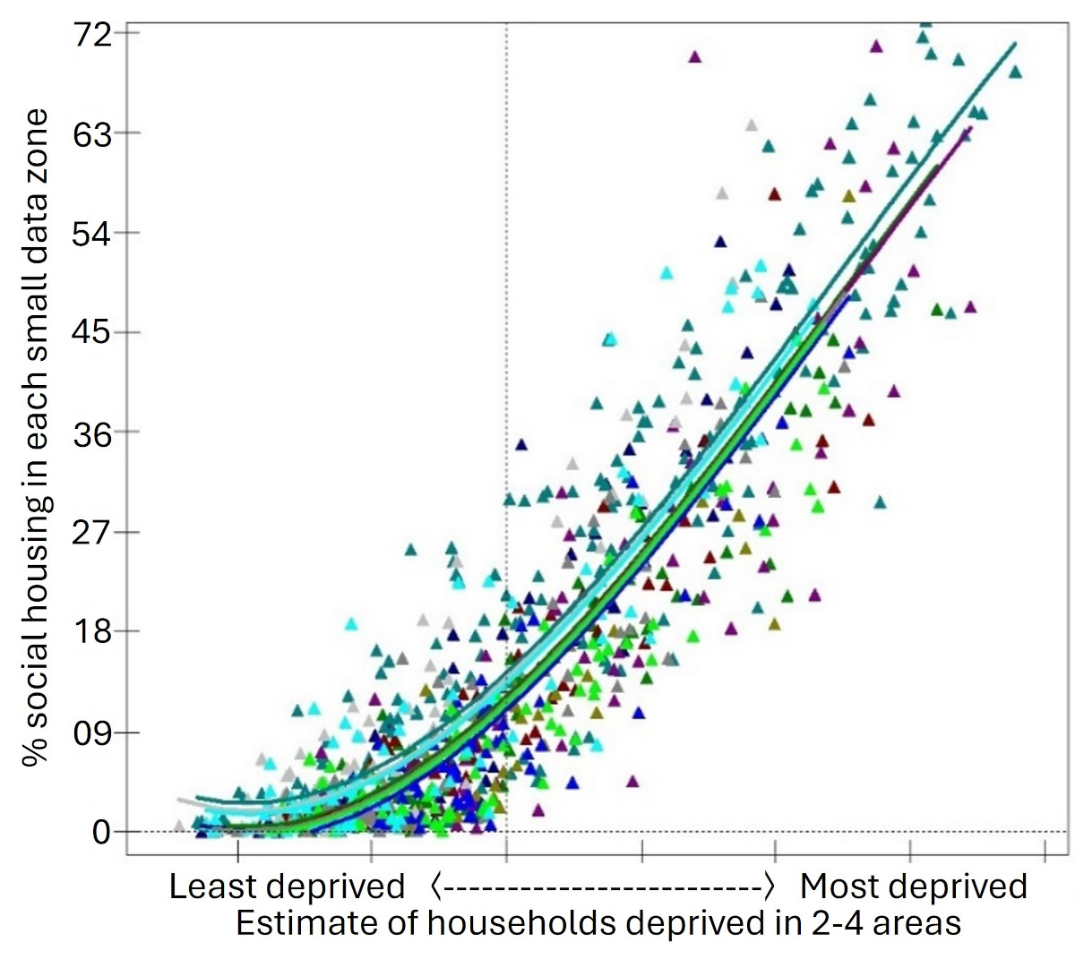
Figure 6b: Social housing provision predicted on the basis of deprivation across LGDs with SDZs included
However, there are some differences in social housing provision between local council areas. To help see it better, see Figure 7 below.
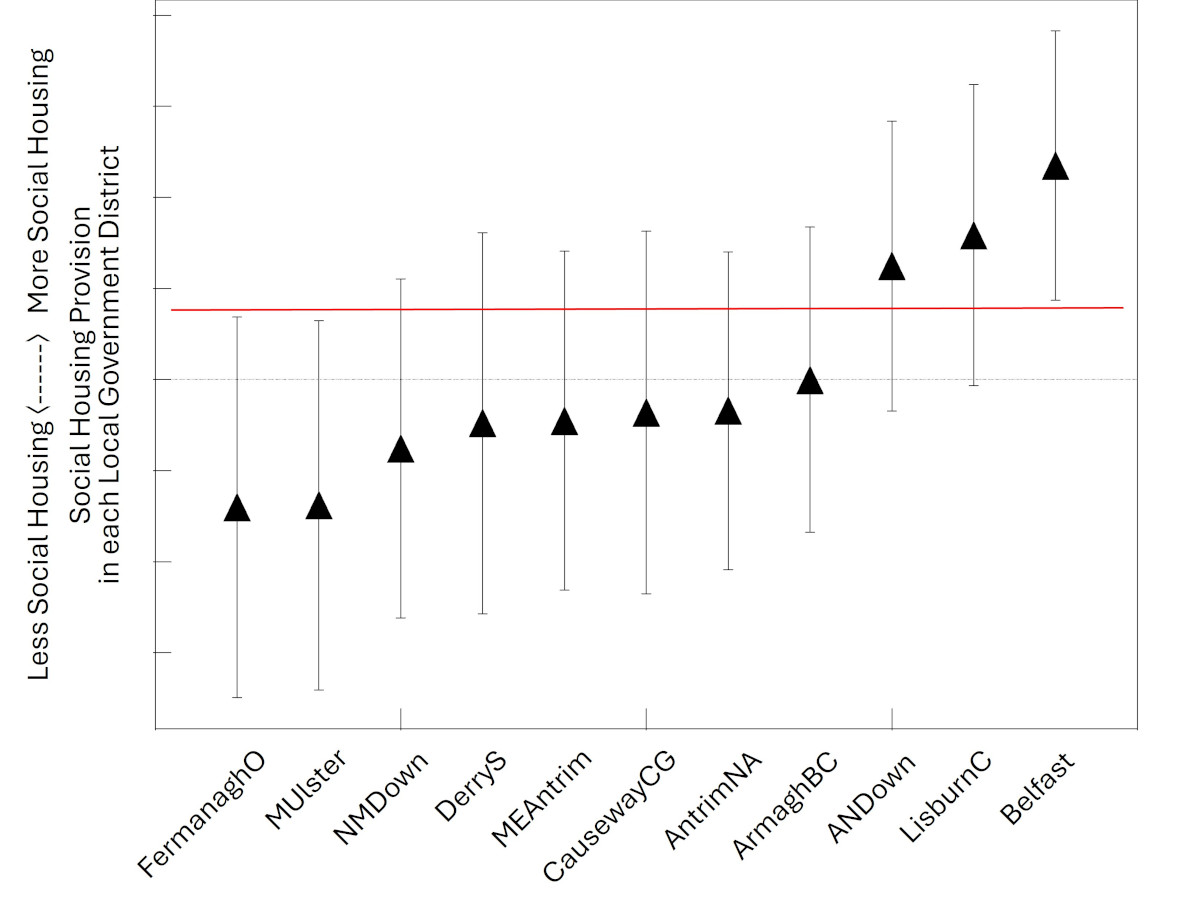
Figure 7: Residual differences in social housing provision across LGDs
The black triangles in this graph show the average level of social housing provision relative to deprivation in each local council area. As you can see, this is much higher in Ards and North Down, Lisburn and Belfast, at the right hand of the graph.
The vertical lines cutting through each triangle show the range in social housing provision relative to deprivation in each area. The range in Fermanagh & Omagh and Mid Ulster on the left of the graph does not overlap at all with Belfast. This means that Belfast (on the right hand side) has more social housing than would be predicted, based on this minimal measure of deprivation, than Fermanagh & Omagh and Mid Ulster (on the left hand side) The overall difference at the local council level is small though; however, as we shall see, differences are greater at District Electoral Area level.
A focus on District Electoral Areas
District Electoral Areas (DEA) are larger than Super Data Zones but smaller than local government/council boundaries. There are 80 in total. We’ve already seen that comparing rates of social housing relative to deprivation at council level shows a consistent overall pattern with a few differences. But what about within local council areas? Are there some DEAs that have less social housing provision than would be expected, based on our limited deprivation measure, and some DEAs more? If there are DEA differences in the relationship between social housing provision and deprivation, it would indicate that housing provision is not being planned in proportion to need.
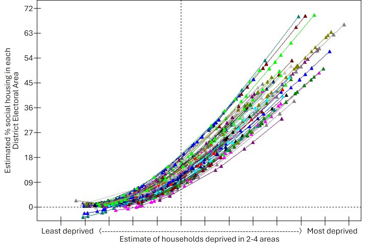
Figure 8: The rate at which social housing provision increases, as deprivation increases, differs across DEAs
Just like before, in Figure 8 we’ve mapped out SDZs as triangles, only this time they are colour coded according to which of the 80 District Electoral areas they belong to. And just like before, we’ve drawn our line of best fit for each DEA.
While there is a positive relationship in each DEA, suggesting that social housing provision is somewhat in proportion to need, the relationship between deprivation and social housing provision differs significantly between DEAs, rather than being uniform.
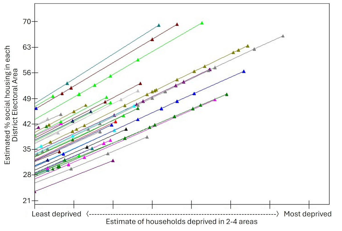
Figure 9: The rate of social housing provision in more deprived areas differs across DEAs
if social housing provision was being planned in proportion to need, all SDZs experiencing a similar level of deprivation would have a similar level of social housing. But in reality, some SDZs and DEAs have more social housing at a given level of deprivation, some less—indicating that housing is not being planned in proportion to need.
If we zoom in on higher levels of deprivation - a bit like taking a close up snapshot of the top right parts of Figure 8, we can see that some SDZs in some DEAs have more social housing than other DEAs with comparable levels of deprivation (see Figure 9). And this is a key point: if social housing provision was being planned in proportion to need, all SDZs experiencing a similar level of deprivation would have a similar level of social housing. But in reality, some SDZs and DEAs have more social housing at a given level of deprivation, some less—indicating that housing is not being planned in proportion to need.
Exploring the differences between District Electoral Areas
So what are the differences between the 80 District Electoral Areas? Are you ready for another graph? Let’s do this.
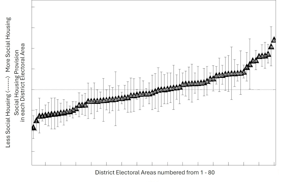
Figure 10: Predicted social housing, on the basis of deprivation, in each DEA, relative to the average, predicted amount of social housing (0-line). The error bars reflect the closeness of SDZs to the line of best fit
Figure 10 below shows the relationship between social housing provision and deprivation in each of the 80 DEAs
We’ve ranked each of the District Electoral Areas according to their ‘line of best fit.’ So each triangle shows the predicted level of social housing in a DEA, on average, based on that DEA’s level of deprivation. The vertical lines show the range in each DEA, with a small horizontal bar or ‘whisker’ to show the top and bottom.
The horizontal ‘0’ line reflects the average proportion of social housing we’d expect across DEAs based on their levels of deprivation. So triangles below the 0-line are DEAs with less social housing than would be predicted on the basis of need. Triangles above the 0-line, are DEAs with more social housing than would be predicted on the basis of need.
There are some DEAs with ranges or ‘whisker’ bars that do not overlap, indicative of DEAs that vary significantly from one another, in terms of the extent to which social housing provision is driven by need. So for example, for DEAs 1-15 on the left hand side of the chart, the Super Data Zones with the most social housing in them have a lower proportion of social homes than the Super Data Zones with the least social housing in DEAs 65-80
In looking at these graphs and the table, do bear in mind that there is significant variability within DEAs also: some SZAs will sit on, or be very close, to the line of best fit; some SZAs will have more housing than would be predicted within that DEA, some less. Also note that areas significantly differ in the extent to which home ownership is possible, and in their dependence on private renting-patterns.
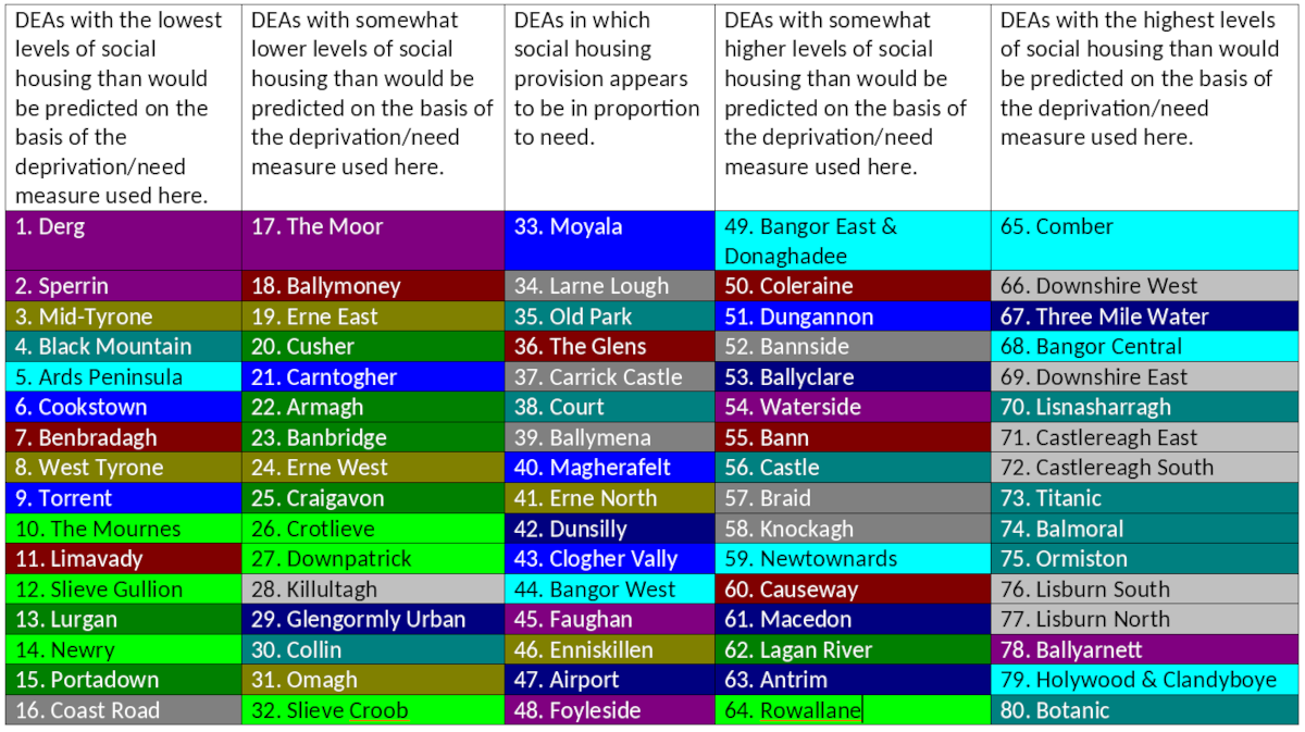
For those who prefer tables, we have included the named ranked DEAs below:
